Color Settings
Theme Options > Styling Options > Color Settings
Here you can define all colors of your site. The colors are defined by Color Schemes that you can easily manage. Each scheme can be related to each part of the theme (header, menu, category, sidebar, ...). You can simply recognize it by the palette icon ![]() .
.
 Main Color Scheme
This is the Main setting of color palette. The scheme you select here, will be applied to the parts of the theme, that haven't set their color schemes.
- NOTE: The color schemes in drop-down list are those that you have created in Color Settings > Color Schemes below.
Color Settings
Load Color Scheme from Demo
If you would like to use any color scheme from demo, add it selecting an chosen color box.
- WARNING: Selecting an color scheme will cause loss of existing color settings.
Color Schemes
Here you can create as many your own color schemes as you want to use on your pages. To create a new preset - color scheme, click [+], enter its name and set colors of the individual elements/items according to your ideas. All Colors can be inputted via the colorchooser popup selector or manually using a hex code or RGB values in the input field.
Once you make and save your preset(s), you can simply clone or delete any of them clicking the appropriate symbol in its heading bar.
- NOTE: The particular color settings in each preset will be applied just to those parts of your web (like categories, pages etc.) with which the preset has been associated.
- HINT: As there are lots of particular color settings for various elements on your site, we recommend that you follow the explanatory screenshots under
 preview icon next to some of the styling options to be able to better understand the settings looking at where they appear on your web.
Name of preset: Type the name of your new preset (Color Scheme).
Background: Set a background color for the main elements of those parts of your web, that use this color scheme.
Alternative Background: Set an alternative background color for the other element of your web, e.g image placeholder, about author etc...
Theme Color 1: This option affects a predefined set of elements, that was designed to make your site balanced and well color-coordinated with each color you can select here.
Theme Color 2: Similarly, the color you select here will be used for a predefined set of other elements used on your pages.
Theme Color 3: The color you select here will stain some predetermined minor elements.
- IMPORTANT: We strongly recommend that all the colors you choose in Theme Color 1, 2, 3 settings above are contrasting to each other, in order to ensure that all content and texts on your pages will be well visible and readable.
Border Color: Depending on other color settings, this color affects borders or/and background of some elements, like e.g. boxes with social icons and number values.
Text Color: Select a color for texts.
Meta Color: Select a color for meta informations.
Link Color: Select a color for links.
Link Hover Color: Select a color for links when hovered over.
Input Text Color: Select a color for texts in the elements that require inputting a content, like e.g. forms.
Input Background Color: Select a background color for the elements that require inputting a content.
[Where is this preset used]: Click the button to find out where this preset is used.
Panel Boxes Colors
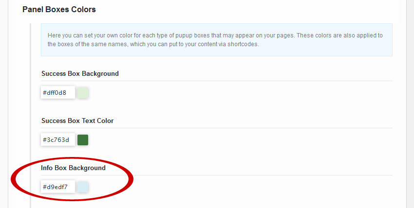
Here you can set your own color for each type of pupup boxes that may appear on your pages. These colors are also applied to the boxes of the same names, which you can put to your content via shortcodes.
![]()
 Info Box Background color setting and an example of how the chosen light blue
appears in the box put between paragraphs.
Success Box Background: Select a background color for "success" boxes.
Success Box Text Color: Select a color for texts in "success" boxes.
Info Box Background: Select a color for info boxes.
Info Box Text Color: Select a color for texts in info boxes.
Warning Box Background: Select a background color for warning boxes
Warning Box Text Color: Select a color for texts in warning boxes
Danger Box Background: Select a background color for "danger" boxes
Danger Box Text Color: Select a color for texts in "danger" boxes
Overlay Gradient Colors
These colors appears on JaW Grid, Slider with thumbnails and Review Posts
Overlay Gradient - Upper Color: Select a color to the top
Overlay Gradient - Bottom Color: Select a color to the bottom
Overlay Colors
These colors appears on Row Slider and Big Photo Slider
Overlay Color: Select a color
If you want to set specific overlay color for a post item, please follow this link
Color Schemes
If you have any issues, please give us a feedback
If you like GDayNews Theme, we would be very happy for stars rating 🙂


