If you are having issues with Gutenberg editor, please simply download official Classic editor plugin.
Haven't found you're looking for? Visit goodstore howto web
Search Nav Bar
-
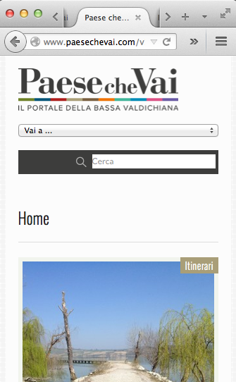
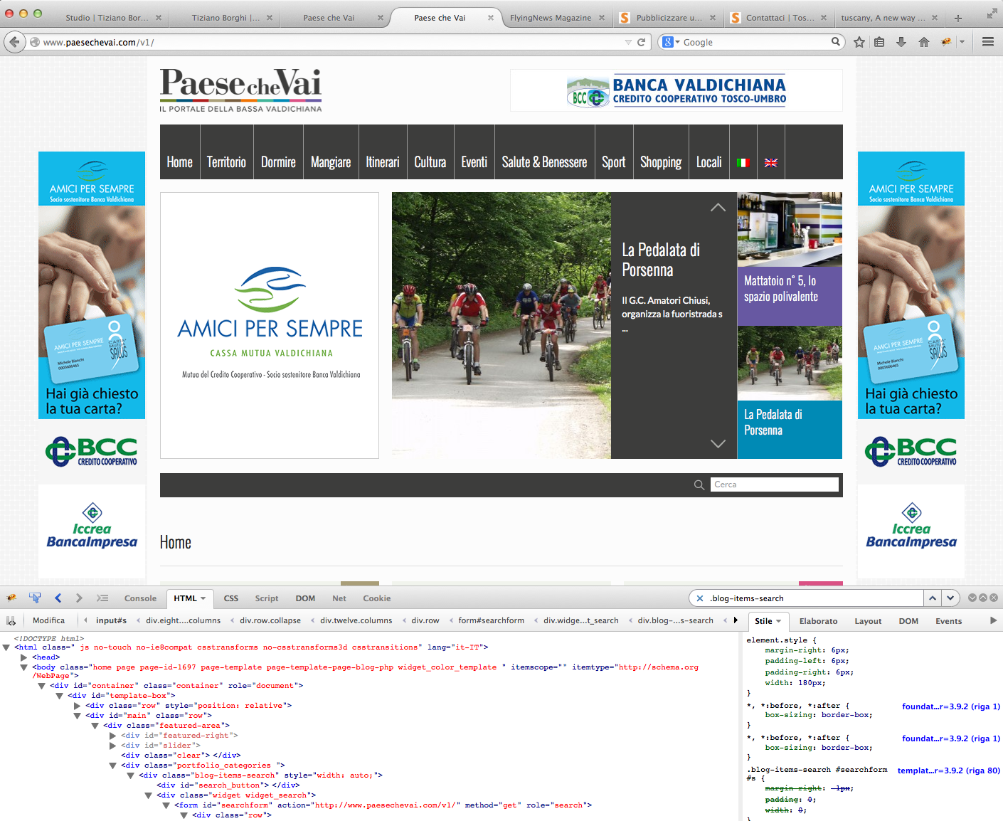
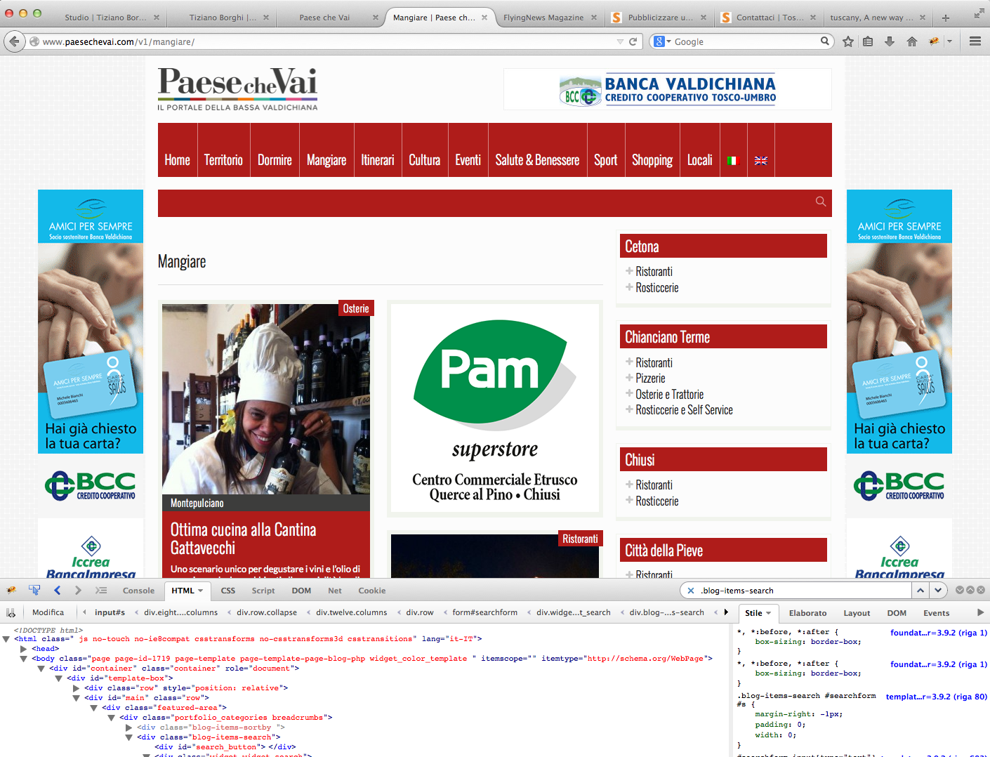
Hi,I would adjust the navbar with only the search section.To do it I have removed breadcrumbs from the bar, and this seems ok.But the search section looks not properly aligned and I am not able to find the right css rule.Can you help me, please?I attach 3 screenshots:1.png > mobile window size (the search field should stay 1px margin-top and 2px margin-right; and the text search, that is cerca in italian, should be with 5px padding-left)2.png > desktop window size (the search field should stay 1px margin-top and 1px margin-right; and the text search is ok)3.png > the navbar on pages (except home page) is more height than on the home: tis is strange... Is it possible to have the bar at the same size (height) on all the pages, home included?This is the only css code I have used to modify breadcrumbs and border radius on search navbar:.blog-items-sortby {display: none;}input[type="text"], input[type="password"], input[type="date"], input[type="datetime"], input[type="email"], input[type="number"], input[type="search"], input[type="tel"], input[type="time"], input[type="url"], textarea {border-radius: 0;}Thanks,Pietro


All following comments are shown for registered users only!
This discussion has been solved.
All Discussions Howdy, Stranger!
It looks like you're new here. If you want to get involved, click one of these buttons!
Categories
- All Discussions3,928
- GDN Theme417
- GoodStore3,231
- JaWesome83
- FlyingNews190
- ImageFetcher7
Powered by Vanilla Copyright 2017 jawtemplates.com Wordpress Themes Studio


