If you are having issues with Gutenberg editor, please simply download official Classic editor plugin.
Haven't found you're looking for? Visit goodstore howto web
logo retina size & header style + Top bar overlap in mobile
-
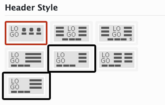
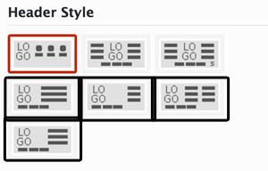
Hi there,(1) logo retina size & header styleWhen I use my retina-sized logo (with Retina Ready set to ON) using the highlighted header styles in the screenshot below, it shows in full 498x138 (meaning the retina half-sizing is not working).
When I switch to the non-highlighted style, the logo is properly resized.
Unfortunately, I was thinking of opting for the first option -- and it's not working :(
(2) Further question: doesn't that first option display any widgets? The icon looks like it does but in practice I don't see any on the screen. (I do have Header Widget Area setting set to ON)(3) top bar overlap in mobileWhen I have top bar visible and fixed top bar settings ON and viewing in mobile, the top bar wraps to a second line.When using some style headers, that second line overlaps the logo area.The styles selected below overlap. Also I noticed that when viewing using RWD Bookmarklet, the top bar doesn't wrap to a second line, but in my Android it does. I wished it was like that on Android too.Can you help with 1, 2, 3?Thanks
All following comments are shown for registered users only!
This discussion has been solved.
All Discussions Howdy, Stranger!
It looks like you're new here. If you want to get involved, click one of these buttons!
Categories
- All Discussions3,928
- GDN Theme417
- GoodStore3,231
- JaWesome83
- FlyingNews190
- ImageFetcher7
Powered by Vanilla Copyright 2017 jawtemplates.com Wordpress Themes Studio


