The GoodStore Documentation
Thank you for purchasing the GoodStore theme. If you have any
questions that are beyond the scope of this documentation, please feel
free to ask us at the themeforest.net comments section. You can e-mail
us at jaw(a)jawtemplates.com as well. We also recommend that you follow video tutorials on our YouTube channel.
Installing the Theme
System Requirements
The GoodStore theme has been tested in WordPress 3.8. However, we
strongly recommend that you always use the latest stable version of
WordPress to ensure that all known bugs and security fixes are
addressed.
Server Requirements
The recommended minimum requirements are:
- PHP 5.3+
- MySQL 5+
- Apache 2.0 (2.2+ recommended)
- mod_mysql
- mod_xml
- mod_zlib
Browser Requirements
The back-end administration requirements of the GoodStore admin panel
in order of preference are as follows:
- Firefox 4+
- Safari 4+
- Google Chrome 3+
- Opera 13+
- Internet Explorer 8+
Installation Procedure
Except the theme itself, the GoodStore consists of four other main parts that are installed separately as the theme´s add-ons, as well as of a few optional 3rd party´s plugins. These are the following add-ons:
- J&W Custom Posts
- J&W Menu
- J&W Shortcodes
- J&W Widgets
- Contact Form 7
- Image Widget
- Wysilja Newsletters
- Revolution Slider
- WooCommerce solution (consists of the WooCommerce, WooCommerce New Product Badge, WooCommerce Sold Out Products, YITH WooCommerce Compare, YITH WooCommerce Wishlist plugins)
To install the theme and all the necessary add-ons, follow the steps below
as well as the messages or recommendations that appear during the installation.
Upload the Theme
IMPORTANT: Make sure you unzip the downloaded file
from ThemeForest first (DON'T upload it to your server yet). This file
contains the actual theme in zip file called goodstore.zip. This is
the theme file. Now install the theme by one of the following two
methods:
- Upload the goodstore.zip file through the WordPress admin backend
(This will ONLY work if the server that hosts your website allows
upload limits greater than 6 MB. Please note that the most
hosting providers have only up to 2 MB file upload limit).
- If you prefer direct access to your folders on server (or uploading
the file using WordPress doesn´t work), use this method. First, unzip
the goodstore.zip file, then upload the extracted goodstore/
folder to /wp-content/themes/
using your FTP client so that the structure was as follows: /wp-content/themes/goodstore/.
Activate the GoodStore theme
If the upload of theme was successful, you can see the GoodStore in list
of the downloaded themes. You can activate it now.
Configure your theme options
To set up your theme, navigate to
Appearance > Theme Options
(see the
2. GoodStore Settings chapter below).
Recommendations to optimize the performance
of your website
After you build your site, we recommend that you deactivate all the
widgets you don´t use in
Plugins > J&W Widgets, Plugins >
J&W Custom Posts and the unused shortcodes in
Plugins > J&W Shortcodes. Remember that loading the unused parts of
various add-ons may needlessly slowing down your web.
We also recommend use of some PHP OPCache on your hosting - e.g. APC and
XCache. On the Wordpress side we recommend installing the W3 Total Cache
plugin, in which is advisable to activate combination and minification of
CSS and JS scripts and activate cache for clients (Gzip, file cache).
GoodStore Settings
You can customize the overall functionality and look of the theme to your
needs.
General Settings
Here can be set up some of the most basic properties of your site. You can
select a theme style, upload your favicon or enable/disable a Top Arrow
icon.
Theme Style
Select the theme style you prefer.
Full Width - choose this option to fit header and some
other parts of your site to the full width of a browser window.
Boxed - select this option if you prefer boxed look of
your site.
Compare the
Full Width theme style on the example
above with the
Boxed one below
Wide Version
Decide whether or not to use wide version of the theme. Simply try both
options to find which one better suits your idea or needs.
Favicon
Click [Upload]
button and upload your prepared 16px × 16px PNG/GIF image
that will represent your website's favicon.
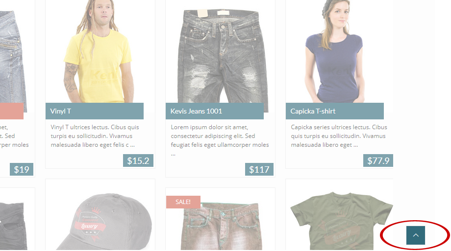
To Top Arrow
Choose whether or not to show the "To Top" arrow.

This is the
To Top Arrow hanging in the lower right corner of your browser´s window after
you have turned on this option. It enables you to quickly jump to the top of page in any time.
To Top Arrow on Mobile Devices
Choose whether or not to show the "To Top" arrow on mobile devices,
independently on the choice above.
Header Settings
The following options allow you to customize content and look of the
header.
Header Style
Choose one of the preset header styles. We recommend that you try each
of them to see how these options affect your page.
Header Widget Area
Choose whether or not to display a Header Widget Area.
Top Bar
This is the color bar at the top of your page. You can set up
its content just here.
Top Bar Visible: Turn on this option if you want to
display the topmost bar
Fixed Top Bar: If turned on, the bar is permanently
shown at the top independently on scrolling the page.
Top Bar Span Icon: Here enter the class of the icon you
want to show in the top bar.
Top Bar Span Text: Fill in this field with the text you
want to show next to the icon.
Show Login Button: Choose whether or not to show login
button in the top bar.
Show Wishlist Content: Choose whether or not to show a
wishlist content button in the top bar. Works with the WooCommerce only.
Show Cart Content: Select the WooCommerce option to show
the cart content. To make this option available, you need to have
installed the WooCommerce plugin.
Show Search: Here you can turn on or off a search field
in the top bar.

This is the Top Bar
Logo Settings
Logo: Click the [Upload] button to select and upload your own
logo.
Logo Margin - Top: This allows to set the top margin of
your logo. Enter a value in pixels.
Logo Margin - Left: Enter the left margin value in
pixels.
Logo Margin - Bottom: Enter the bottom margin value in
pixels.
Retina Ready: This option allows to display your logo in
high quality on the Retina displays.
- NOTE: Although you can use your
logo with the dimensions you need, let us take our logo as an example to
explain the issue. Size of this logo is 249×69 px if
it has not to be retina ready. If you prepare a retina ready logo, you
should create it with double width and height, i. e. 498×138 px.
Remember that if the „Retina Ready“ option is set on, your logo will
be displayed in its half size on non retina displays, so it won´t
affect the actually displayed size. Make sure you have set
the option off if you use a standard sized logo (249×69
px), otherwise it couses that the logo will be displayed too small
on both of display types.
Menu Bar
Fixed Menu Bar: Turn on this option if you want to have
the top menu bar permanently displayed, independently on scrolling the
page.
Border Menu Bar: Here you can turn on/off an unobtrusive
grey line at the top and bottom of your menu bar.

The Menu Bar
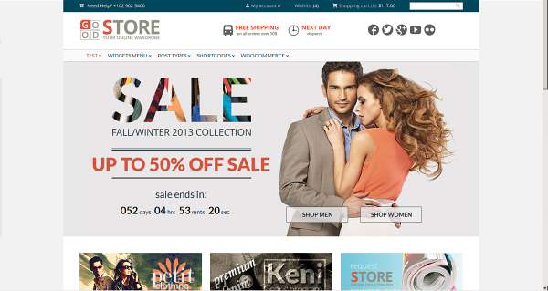
Featured Area
Settings in this section allow you to customize your featured area.

An example of the Featured Area. You can specify what content to show
there and whether
to display the area on all your web or on the home page only, or not at
all.
2.3.1 Settings
Featured Area Placement
Choose where to display the featured area, or select the off option if it
has not to be used.
Featured Area Content Type
Here you can choose type of your featured area´s content.
Page ID: If selected, a page of your choice will be
displayed in the featured area. To make it possible, you need to enter a
valid ID of the page into the
Custom Header Page ID field below.
Revolution Slider: Select this option, if you want to use
the Revolution Slider in your featured area.
JaW Slider: If you prefer using the bundled J&W Slider,
choose this option. Please go to the
2.3.2 J&W
Slider subchapter to learn how to set up and use the slider.
Slider Options
Revolution Slider Name: Use this option if you have
chosen the
Revolution Slider in the settings above. Select a
slider you have created in the
Revolution Slider settings from
this dropdown list.
Page Options
Custom Header Page ID: If you have chosen the
Page
ID option in the
Featured Area Content Type settings
above, enter an ID of the page you want to use in your featured area
content.
2.3.2 J&W Slider
Here you find all the options you need to set up the
J&W
Slider placed in the featured area. To learn how to put the slider to your page, go to the
11.
Slider chapter, please.
-
NOTE: The J&W Slider settings below take effect only in the Featured Area either on the Home Page or on your All Web pages (or not at all) depending on what option you have chosen under the Featured Area Placement above. However, you can create and add separate sliders with independent settings for each page you want, when you build these pages by using e. g. the REVO Composer page builder.
Content
Slider Full Width Styles
Off: Select this option if you don´t want to use the
slider in any full width mode.
Boundary Color: If selected, this option makes your
slider as wide as the content underneath, but adds a custom color around
the slider. This colored area is expanded to a full width of browser´s
window.
Full Width: Expands your slider to the full width mode.
Post Type
Choose whether to show
posts or
products
in the slider.
Number of Items
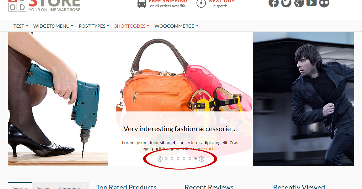
Set number of items you want to have in the slider.

The marked array of bullets represents your slider´s items - their number corresponds to the
Number of Items you have set (the whole slider is animated according to your settings under the
Animation option below)
Post Order
Here you can choose the posts order way you prefer –
ascending
or
descending.
Post Order by
Order posts by their parameters:
Date: Order by date
None: No order
ID: Order by post ID
Author: Order by author
Title: Order by title
Modified: Order by a last modified date
Parent: Order by post parent IT
Rand: Random order
Count: Order by number of comments
Blog & Posts
Include Category (optional)
Click into the field/dropdown list to choose all categories you want to
fetch posts from.
Include Posts (optional)
Choose just the posts you want to show. Insert their IDs and separate them
with coma (like 52, 45, 87 etc.). If you leave this field blank, all posts
will be used.
Include Authors (optional)
Select the authors whose posts you want to display. If you leave this
field blank, the posts from all authors will be used.
Include Tags (optional)
Specify the tags which the posts you want to fetch have to include.
- NOTE: In case of using the Include
Category, Include Posts and Include Authors options above, the AND
operator is used (i. e. all of the chosen items are included in the
displayed content).
Sticky Posts
Choose how to use your sticky posts:
Use as common posts: Your posts will be used according to
their sticky feature.
Ignore sticky posts: The posts marked as sticky will be
ignored in the slider.
Show only sticky posts: There will be used just sticky
posts in the slider.
Products
Show only featured products
Set this option on if you want to show just the featured products in your
slider. If it is set off, all your products may be displayed.
Include Product Category (optional)
Click into the field/dropdown list to choose all products categories you
want to fetch products from.
Include Products (optional)
Choose just the products you want to show. Insert their IDs and separate
them with coma (like 52, 45, 87 etc.). If you leave this field blank, all
products will be used.
Include Products Tags (optional)
Specify the tags which the products you want to fetch have to include.
Animation
Animation latency
Set a speed value of changing slides in your slider.
Animation speed
Depending on this value in milliseconds, slides and their descriptions
move more or less slowly and smoothly. This only affects the motion
effect, but not an animation latency.
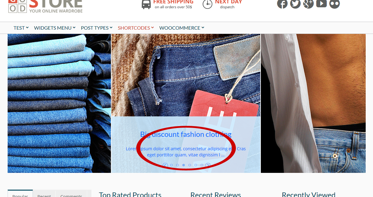
Design
Info Box Text Color
Click into the field and select or enter the color value you want to set for
texts in your slider.
Info Box Color
Select a background color for the info box.
Info Box Opacity
Here you can set an opacity level for the info box.
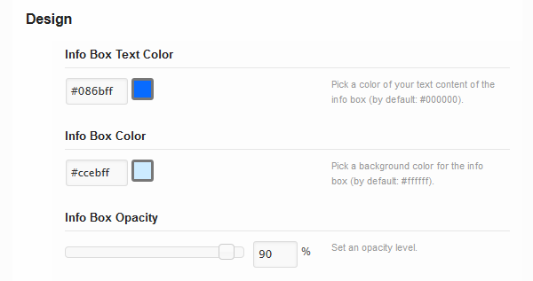
Compare the sample color and opacity settings of the slider´s info box with the result

Footer Settings
The following options allow you to customize content and look of the
footer.
Footer Featured Area Options
Footer Featured Area Assignment: Decide whether or not to
display your footer featured area (displayed above the footer) and where
to assign it. You can choose between the home page and all the web.
Custom Footer Page ID: Enter ID of the page you want to
use in your featured area content.
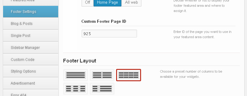
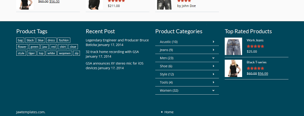
Footer Layout
There are several preset layouts divided into various numbers of columns
available for your widgets. Select the option which best suits your needs.
Show Copyright
Decide whether or not to display your copyright info in the footer.
Look at how the chosen four columns layout (fig. above) affects the
footer in the example below
Blog & Posts
Here you can find all the options you need to set up your blog and
posts.
2.5.1 Post Settings
Show Breadcrums
Decide whether or not to show breadcrumb navigation in categories,
archives, tags, search, portfolio categories and inside posts.
Category & Tag Bar Type
Choose one of the available category and tag bar types. To see where this
setting appears, click the preview icon next to the option title.
Post Boxes Type
Select size of boxes for your posts. If you choose the [Small+Middle]
option, only the latest post will be boxed in the middle size box.
Number of Posts
There are several ways to load posts. Here you can set number of posts per
page loaded using the Pagination Style you have set in
Pagination
Style below.
Hyperlink Post Images
You can specify that post images are hyperlinked as well as the titles
are. If this option is set off, only titles are linked to the whole posts.
Pagination Style
Select the pagination style you prefer from the following options:
ajax: Gets content in two consecutive batches of posts
(their number is determined in
Number of
Posts above)
infinite: Allows the consecutively automatic loading of
all your posts in „flying“ batches when the page is scrolling
infinite with more: Performs the same, but not
automatically – you need to click on the „more“ link after each loaded
batch of posts
none: Fetches just your preset number of posts per page
number: Gets the same result, moreover with the clickable
page numbers at the bottom
wordpress: Allows the standard Wordpress pagination style
Search/Archive/Category Layout
Here you can choose one of the three preset layouts for your blog search,
archive and category result page.
Search/Archive Left Sidebars
You can choose one of the sidebars you have added in the Sidebar Manager
section (subchapter
2.7 Sidebar Manager).
Search/Archive Right Sidebars
You can choose one of the sidebars you have added in the Sidebar Manager
section (subchapter
2.7 Sidebar Manager).
Meta Data
Here you can set up what has to be shown in the post preview.
Meta Post Format Icon: Choose whether or not to show post type icon. Note, that no icon will be shown in previews of posts in Standard or Quote format.
Meta Author: Choose whether or not to show author´s name.
Meta Date: Choose whether or not to show date.
Meta Number of Comments: Choose whether or not to show number of comments in the post preview.
Meta Category: Choose whether or not to show category in the post preview.
Ratings: Choose whether or not to show ratings.
Post Date Format: Define the date format for your
posts. Please visit the link next to this option to learn how to use the
characters convention.
2.5.2 Main Blog
Blog Layout Settings
Blog Page Layout: Choose one of the available layouts for
your blog page. Depending on what layout you choose, the options below
will vary.
Blog Left/Right Sidebar: Select an optional sidebar from
the dropdown list of your custom ones you had created in
Appearance > Theme Options > Sidebar Manager.
Show Sorting: Decide whether or not to show sorting on
your blog page.
Include Category
Click into the field/dropdown list and choose all categories you want to
fetch posts from.
Post Order
Here you can choose the posts order way you prefer –
ascending
or
descending.
Post Order by
Order posts by their parameters:
Date: Order by date
None: No order
ID: Order by post ID
Author: Order by author
Title: Order by title
Modified: Order by a last modified date
Parent: Order by post parent IT
Rand: Random order
Number of comments: Order by number of comments
Single Post
Post Layout
There are three preset layouts for your post content. Here you can
choose one of them. Depending on what layout you choose, the options
below will vary.
Post Left/Right Sidebar
You can choose one of the sidebars, you have created in the
Sidebar
Manager section and add it to the right.
Share Post Bar
Choose whether or not to make a bar with various sharing options
available below the posts.
Related Posts
Turn this option on if you want to show the latest posts section on
your post page.
Number of Related Posts
Enter a number of related posts you want to show.
Use Image in Post as Featured
Turn this option on if you want to use the image you have inserted in post
as featured.
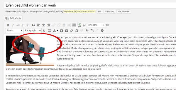
The marked image in the example would be displayed in this post´s
preview if you turned on
the
Use Image in Post as Featured option, otherwise it
would be visible only in the post´s content.
Use Featured Image/Gallery/Video in Post
You can choose whether or not to display a featured image or gallery or
video at the top of your post. If the option is set off, only the possible
images which you have put into the post content are shown.
- NOTE: An image is displayed always
when the featured image has been set. A gallery is taken from the post
if the Gallery post format has been set, a gallery is taken
from the link when the Video post format has been set.
Use Pretty Photo for Gallery
Turn on this option if you want to use the Pretty Photo effect (similar to
the lightbox feature) for your gallery items.
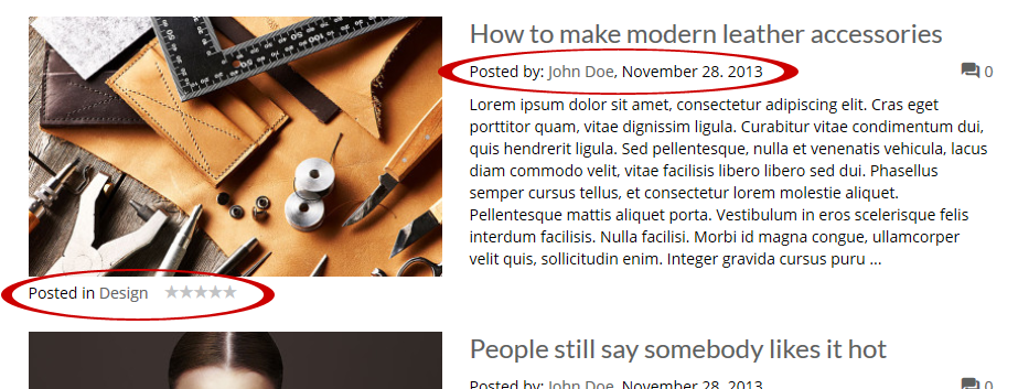
About Author
Choose whether or not to display the author's name with photo and
description in a post.
Meta Options
Here you can set up what has to be shown in a single post.
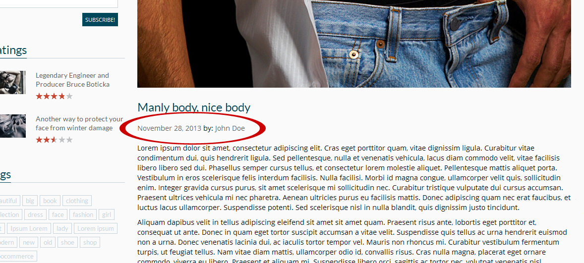
Meta Post Author: Decide whether or not to show
author´s name.
Meta Post Date: Decide whether or not to show
publishing date.
Ratings: Decide whether or not to show rating in posts.
Post Format Icon: Choose whether or not to show post format icon. Note, that no icon will be shown in posts in Standard or Quote format.
Number of Comments: Decide whether or not to show number of comments in posts.
Post Category: Decide whether or not to show post category.
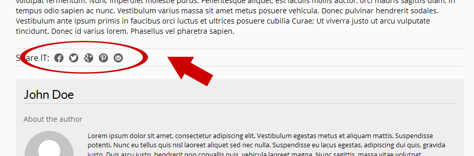
Sharing Options
You can add icons of the most common social networks and services you want
the post to be shared on to the
Share Post Bar. Choose from
Facebook,
Twitter, Google, Pinterest and
E-mail items.
Comments
Turn on or off the
Show comments depending on your
choice.
Facebook Comments
Here you can set up your Facebook Comments. To make the options work, you
have to enter your Facebook App ID in the
Advanced
section.
Facebook Comments: This option gives you choice to toggle
between wordpress and facebook comments.
Number of Comments: Enter a number of comments to
display.
Sidebar Manager
This is the place where you can add your optional sidebars.
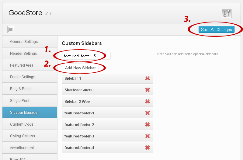
Custom Sidebars
Fill in the field with a name you want and click the [Add New Sidebar]
button. By the same way you can create all sidebars you need. Clicking the cross

removes the chosen sidebar. Once you are done, don´t forget to save your changes.
Notice that you find the created sidebars in the Widgets settings and can
assign some widgets to them.
Sidebars Bar Type
Box: Makes titles of your sidebars boxed. To set a color
of these boxes, go to
Appearance > Styling Options (for
details go to
2.9. Styling Options
subchapter).
Big Title: Sidebars use a heading style which you can set
in
Appearance > Styling Options.
Custom Code
There are several fields for your CSS, javascript and analytics codes, as
well as for shortcodes for the footer text.
Custom CSS
allows you to implement your own styles in the selected preset (it will
paste the inline css styles in code). Similarly the
Custom
Javascript allows you to implement a javascript. Paste your
Google Analytics (or other) tracking code to the
Google Analytics
field to show the desired outputs in the footer of your theme. You can
fill in the
Footer Text field with your own plain or
HTML tagged text.
Styling Options
In this section you can choose some color presets for your theme, as
well as customize color variations according to your wishes. Colors can
be inputted via the colorchooser popup selector or manually using a hex
code in the input field.
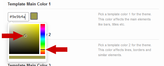
To activate the colorchooser, click into the value field and move both
the right scroll
bar and the pointer across the color palette until you
find the color you need.
- HINT: As there are lots of
particular color settings for various elements of your site, we
recommend that you follow the explanatory screenshots under the
preview icon
 next to some of the styling
options to be able to better understand the settings looking at where
they appear on your web.
next to some of the styling
options to be able to better understand the settings looking at where
they appear on your web.
Template Background Settings
Background Image: Click [Upload] button to upload your
background image.
Background Texture: These boxes allow you to choose a
background texture. If you select the cross filled box, no texture will be
used.
Background Color: Pick a color from the palette or enter
a hex code.
Box Background Color: This color is applied just to a box
with the main content, but not to the whole window of a browser. Pick a
color from the palette or enter a hex code.
Template Color Settings
Load Color Scheme: Choose a color scheme you want to use.
These colors affect all the main graphic elements of the theme, but you
can also modify many of individual elements by using the following
settings.
- WARNING: Selecting an color scheme
will cause loss of the existing color settings. After selecting an item
you will be informed about this and asked whether to continue.
Main Color Settings
Here you can define custom colors of some groups of elements on your web.
Template Main Color 1: This color affects the main
elements like bars, titles etc.
Template Main Color 2: Affects lines, borders and similar
elements on your site.
Template Main Color 3: This setting affects especially
background of various text elements like boxes, comments etc.
Font Color Settings
These options allow you to set font colors for paragraphs and links. For
details, see the related descriptions.
Page Title Color Settings
Define color settings of titles. For details, see the related
descriptions.
Header Color Settings
Use these options to define colors of various header´s elements. For
details, see the related descriptions and/or click the preview icon.
Menu Color Settings
Here are several settings available to define colors of your menu items.
For details, see the related descriptions and/or click the preview icon.
- NOTE: The menu color settings work only
with the Small header style.
Submenu Color Settings
Define colors for submenu items. For details, see the related descriptions
and/or click the preview icon.
Footer Color Settings
There are several footer color settings which makes you be able to
precisely define colors of various elements in the footer according to
your needs. For details, see the related descriptions.
Post Font Color Settings
All these settings are related to the text content of posts and to their
titles. For details, see the related descriptions.
WooCommerce Color Settings
In this section you can see a lot of settings related to the elements of
your e-shop carried on using the WooCommerce solution. For details, see
the related descriptions. These settings work only with the WooCommerce
plugin installed and activated.
Message Color Settings
Here you can define colors of your choice for various kinds of messages.
For details, see the related descriptions.
Comments Color Settings
There are a few color settings for comments. For details, see the related
descriptions.
Template Fonts Settings
Title Font: Here you can change the title font. This
doesn´t affect the font size, both the typeface and color remain standard.
Paragraph Font: Paste your paragraph font name into the
field and choose a size, style, and color from the dropdown lists.
Other Styling Settings
Rating Color: This is a color of the rating stars.
Big Title Font Size: Set font size for the Big type of
titles.
Advertisement
The GoodStore theme allows you to display and manage several kinds of
banner ads on your web. You can configure and use your banner positions.
2.10.1 Banner - Background
This special kind of ads allows you to utilize a free space around the
main content for advertisement in the form of background image. To prepare
or get such ad which will exactly fit your site, we recommend respecting
the fact that a central 1040 pixels wide column of the image/ad won´t be
visible because of hide behind the main content. On the other hand, both
the left and right side of the background image should be designed for
advertising. You can set their behaviour just here.
Show Banner
Decide whether or not to show banner background ads.
Background Banner Image
Click the [Upload] button to select your prepared background ad.
Target Link on Left Side
Put a target URL for the left side of your banner background into this
field.
Width of Area for a Target Link on Left Side
Enter a width of the left side banner´s area which has to be an active
link.
Target Link on Right Side
Put a target URL for the right side of your banner background into this
field.
Width of Area for a Target Link on Right Side
Enter a width of the right side banner´s area which has to be an active
link.
Banner Link Target
Specify where to open an advertiser´s link.
2.10.2 Banner - Leaderboard
The options below allow you to manage the top banner position.
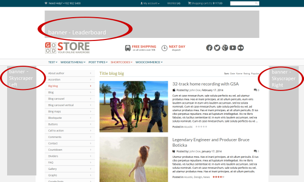
The
Leaderboard and
Skyscraper banner positions placement on a sample blog page
- NOTE: Depending on whether or not you
have chosen a wide version of the theme (in Theme Options >
General Settings), the recommended widths of this ad are 1175px
or 960px.
Show Banner
Decide whether or not to show ad.
Banner Type
Select the banner type you prefer from the dropdown list. You can choose
between image and Google ads.
Banner Image
Click the [Upload Image] button to select and upload your banner
or select the [Remove] option that appears, if you want to remove
this banner.
Target Link
Insert a target URL for the Leaderboard banner into this field.
Banner Link Target
Specify where to open an advertiser´s link.
Google Ads Code
Insert the Google Ads Code.
Notice: You
can use maximally 3 Google ads on one page.
2.10.3 Banner - Skyscraper Right
Here you can manage the right lateral ad position.
Show Banner
Decide whether or not to show ad.
Banner Type
Select the banner type you prefer from the dropdown list. You can choose
between image and Google ads.
Banner Image
Click the [Upload Image] button to select and upload your banner
or select the [Remove] option that appears, if you want to remove
this banner.
Target Link
Insert a target URL for the banner into this field.
Banner Link Target
Specify where to open an advertiser´s link.
Google Ads Code
Insert the Google Ads Code.
Notice: You
can use maximally 3 Google ads on one page.
2.10.4 Banner - Skyscraper Left
The options below allow you to manage the right lateral ad position.
-
NOTE: The recommended size of a Skyscraper banner is 160×600 pixels.
Show Banner
Decide whether or not to show ad.
Banner Type
Select the banner type you prefer from the dropdown list. You can choose
between image and Google ads.
Banner Image
Click the [Upload image] button to select and upload your banner
or select the [Remove] option that appears, if you want to remove
this banner.
Target Link
Insert a target URL for the banner into this field.
Banner Link Target
Specify where to open an advertiser´s link.
Google Ads Code
Insert the Google Ads Code.
Notice: You
can use maximally 3 Google ads on one page.
2.10.5 Banner In Post - Top
Here you can manage the top banner position in posts.
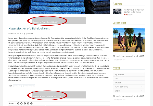
An example of post with both the
Banner In Post - Top and the
Banner In Post - Bottom positions occupied
Show Banner
Decide whether or not to show ad.
Banner Type
Select the banner type you prefer from the dropdown list. You can choose
between image and Google ads.
Banner Image
Click the [Upload Image]
button to select and upload your banner
or select the [Remove]
option that appears, if you want to remove
this banner.
Target Link
Insert a target URL for the banner into this field.
Banner Link Target
Specify where to open an advertiser´s link.
Google Ads Code
Insert the Google Ads Code.
Notice: You
can use maximally 3 Google ads on one page.
2.10.6 Banner In Post - Bottom
This is the bottom banner position in posts. Set up and manage it in the
same way as the
Banner In Post - Top above.
Show Banner
Decide whether or not to show ad.
Banner Type
Select the banner type you prefer from the dropdown list. You can choose
between image and Google ads.
Banner Image
Click the [Upload Image]
button to select and upload your banner
or select the [Remove] option that appears, if you want to remove
this banner.
Target Link
Insert a target URL for the banner into this field.
Banner Link Target
Specify where to open an advertiser´s link.
Google Ads Code
Insert the Google Ads Code.
Notice: You
can use maximally 3 Google ads on one page.
2.10.7 Banner -
Custom 1
Besides the common ad positions (see the settings above), you can use two
custom banners with the J&W - Custom Banner Widget (chapter
10.
Widgets -
J&W -
Custom Banner Widget). Here is the place where to set up and
manage the first of them.
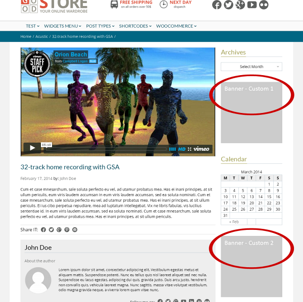
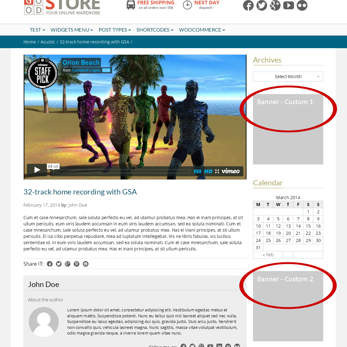
An example of the
Banner - Custom 1 and
Custom 2 ads placement
-
NOTE: Depending on whether or not you have chosen the wide version of the theme (in Theme Options > General Settings), the recommended widths of this ad are 275px or 250px.
Show Banner
Decide whether or not to show ad.
Banner Type
Select the banner type you prefer from the dropdown list. You can choose
between image and Google ads.
Banner Image
Click the [Upload Image] button to select and upload your banner
or select the [Remove] option that appears, if you want to remove
this banner.
Target Link
Insert a target URL for the banner into this field.
Banner Link Target
Specify where to open an advertiser´s link.
Google Ads Code
Insert the Google Ads Code.
Notice: You
can use maximally 3 Google ads on one page.
2.10.8 Banner - Custom 2
Set up and manage this banner position in the same way as the
Banner
- Custom 1 above.
Error 404
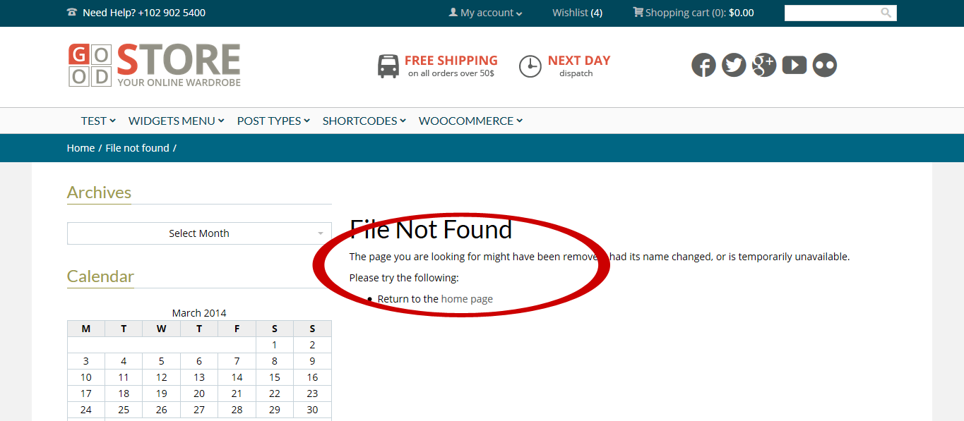
Here you can create your own custom html 404 Page. Simply enter the HTML
code you want to appear instead of common browser´s page when the 404
error occurs.
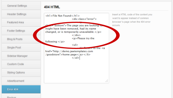
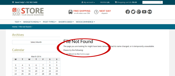
Look at how the sample HTML code (fig. above) appears when the
404 error occurs
Backup
Backup and Restore Options
Here you can backup your current options, and then restore them back at a
later time. This is useful if you want to experiment on the options but
would like to keep the old settings in case you need it back. Click the [Backup Options] button to backup your current saved options in the
Category, Menus and
Theme Options. If you need to restore the options,
click the [Restore Options]. Please read carefully the warning
message which will appear.
Backup to Google Drive
You can easily backup your settings to the Google Drive. To do it, click
the button. All the setting will be encoded and uploaded to your Google
Drive.
Transfer Theme Options Data
You can transfer the entire saved Theme Options data between different
installations by copying the text inside the text box. To import data from
another installation, replace the data in the text box with the one from
another install and click the [Import Theme Options].
- HINT: You can simply copy the data
from the box to some txt file and keep it as backup.
Transfer Menu Options Data
To import data from another installation, replace the data in the text box
with the one from another install and click the [Import Menu Options].
Transfer Category Options Data
To import category options data from another installation, replace the
data in the text box with the one from another install and click the [Import
Category Options].
Transfer PageBuilder Presets Data
In the same way as all the options data above, you can also transfer your
saved PageBuilder presets data between different installations by copying
the text inside the text box. To import data from another installation,
replace the data in the text box with the one from another install and
click the [Import PageBuilder Presets].
Demo
If you need or would like to upload the sample data to make your website
look like our demo, click the thumbnail of the demo site you prefer.
- IMPORTANT: When uploading the demo
content you may lose your data. Please don´t forget to back-up your
database before you choose an option.
Advanced
There are several special options which you can choose and set up for your
page.
Right to Left
Turn on this option if you want to enable support for RTL (Right-To-Left)
languages.
Notification of New Updates
If you want to be informed about new available updates, turn this option
on.
Social Plugins Language
Here you can select the language of your choice for the social plugins.
Please visit the link at this option to get the language codes list.
Modal Window on Start
You can enable a modal window and set a page that has to be shown in this
window when visitor opens your site first time.
Show Modal Window on Start - turn on or off this option
depending on whether or not you want to enable this window.
Modal Window Page ID - insert ID
of the page you want to show as content of your modal window.
- NOTE: If you create a page for your
modal window by using the REVO Composer page builder,
you can only use an eight-columns design.
Facebook API
Facebook App ID: You have to enter your Facebook App ID
to be able to share your site and to make a Facebook commentary.
FB Comment Moderation Area: If you
are a moderator, you will see notifications within facebook.com. If you
don't want to have moderator status or want to see all comments in one
area, use the Comment Moderation Area link.
Twitter API
To be able to set up and use your latest tweets from the Twitter on your
site, you need to enter your Twitter API´s keys -
API Key,
API Secret,
Access Token and
Access
Token Secret. To get them, please visit
https://dev.twitter.com/apps/new.
Instagram API
To get all the necessary keys for use of your Instagram account with your
site, follow the next steps below, please:
- Create a new aplication here.
Set the Required URI item to the generated link. Get both
the App Client ID and the App Client Secret
keys and paste them into the appropriate fields. Click the [Save
All Changes] button and refresh the page (Ctrl+F5).
- Instagram App: Click the Get Instagram Access
Token link, save your changes and refresh the page again.
When you set up your J&W
- Social Widget, you need to fill in the User ID item. To
get this ID, please click here.
Comments Antispam Question
Here you can manage an antispam solution for comments on your site.
Enable an Antispam Question: Turn the option on to enable
an antispam question
Comments Antispam Question: Fill in the field with an
easy question to be answered by user before inserting comment.
Comments Antispam Answer: Insert a proper answer to the
question.
Animation
The options below allow you to globally set up behaviour of images on your
pages when the animation feature has been enabled for them.
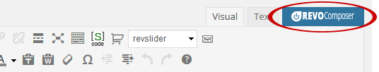
- NOTE: To set an animation effect
and some other options for each image separately, open the page/s (Pages > your page or Add New), activate the REVO
Composer tab and use the settings tool at the header of each frame
of images which have to be animated (or click the Image icon to add new
image to your layout and then use the settings tool). Click the
Animation tab in the opened settings window and make settings you need.
Animate Image: Turn on or off the option depending on
whether or not to apply an animation effect to your images with a global
effectiveness.
Animation Style: Click into the
field/dropdown list and select one from the available styles.
Animation Direction: Select a direction. This option
takes effect just on some animation styles.
Animation Speed: Set animation speed in miliseconds.
Animation Easing: Select the easing effect you prefer. To
learn more about the available effects, visit this
help
link.
WooCommerce
If you have installed the third party´s WooCommerce 2.1+ plugin, you can
improve its integration with the GoodStore theme by the settings below.
Product Box Style
Specify a look of your product boxes selecting one from the four available
styles:
Light: A light style without product description, border
or any other kind of highlight.
Color: Some main elements of your product boxes are in a
main template color (set this color in
Appearance > Theme Options > Styling Options).
Boxed: This option makes look of your product boxes
similar to when you use the Light option, but with frame around.
Small: The product boxes look similar to the Light style
above, but are smaller.
Product Box Image Animation
You can choose a behavior of images in your product boxes when mouse is
moved over them.
Off: Takes no effect when you move mouse over a product.
Simple Hover: Another image from
the product gallery appears (always the first one of all images in your
product galleries).
Fade: Like the Simple Hover option, but with a smooth
transition effect.
Show Breadcrumbs
Decide whether or not to show a breadcrumb navigation in product
categories and inside products.
Product Category & Tag Bar Type
There are two styles of category titles. Select the one you prefer.
Product Page
Here you can set up a look of your product page.
Product Page Layout: Select a main content and sidebar
alignment. Depending on what layout you choose, the options below will
vary.
Product Left/Right Sidebars: Select an optional sidebar
from the dropdown list of your custom ones you had created in
Appearance > Theme Options > Sidebar Manager.
Number of Related Products: Set number of related
products.
Related Product Box Style
Light: A light style without product description, border
or any other kind of highlight.
Color: Some main elements of your product boxes are in a
main template color (set this color in
Appearance > Theme Options > Styling Options).
Boxed: This option makes look of your product boxes
similar to when you use the Light option, but with frame around.
Product Category
Set up your product categories properties.
Product Category Layout: Select a main content and
sidebar alignment. Depending on what layout you choose, the options below
will vary.
Product Category Left/Right Sidebars: Select an optional
sidebar from the dropdown list of your custom ones you had created in
Appearance > Theme Options > Sidebar Manager.
Product Tag
You can set up your product tag pages in the same way as the product
categories above. Choose one of the available layouts and if need be,
select a custom sidebar.
Pages
REVO Composer Page Builder
This is an advanced solution to build your pages easily and intuitively.
Thanks to its visual conception, the REVO Composer makes you be able to
create your pages much faster, comfortable and efficiently than in a
common way. The GoodStore theme gives you possibility to choose between
using of
shortcodes and this advanced page builder.
How to start
To start using of the REVO Composer, you first need to create a new page.
After you choose the Add New Page option (or open an already created one),
you will find the
REVO Composer tab added above the content editor´s
tools. Click the tab and get started.
Now, you can see an empty
page content area divided into
12 columns and several
groups of tools - page elements,
which you can add to the page, compose and set up them, while the elements
arrangement is visualized. Moreover, there is a live preview option to
make you be able to see result of your work before you publish it.
Using of the REVO Composer
To
add an element to your page, simply click the
appropriate icon. Depending on type of element, it will align with a
various number of columns in default. You can
change width of the
element clicking the left or right arrow in its header (the
Size option

).
Besides the

cross icon for removing the element, there is a group of four tool icons
in each element frame´s header:
 Settings:
Use this tool to set up the main properties of the element.
 Preview:
The live preview option. Allows you to see a real content of the
element. Be aware of that depending on a content, the live preview may
slow down work with the page builder.
 Copy:
Copy:
Click this icon to make a copy of the element, including its
setting.
 Save:
Save:
Use this option to save the element´s settings as a preset for this kind
of element for the page you are working with. If you then add another
instance of the element to your page, it will take the saved presets.
Each element box contains a
title field to be filled in
or renamed. All elements can be rearranged by a drag ´n drop method.
Simply move your mouse over the element until a cross appears. Then move
the box to the position where you want to place the element.
- NOTE: Every new element will be
automatically put below the previously inserted ones. Then you can
easily rearrange it.
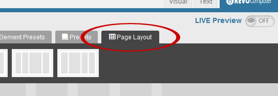
3.1.1 Page Layouts
The REVO Composer allows you to work not only with the page content, but also with the entire layout. Simply click the
Page Layout tab and choose the layout that best suits your needs. To assign your sidebars to the chosen layout, click the
settings icon and follow the appropriate descriptions. Also refer to
2.7 Sidebar Manager subchapter.
3.1.2 Presets
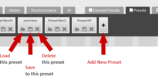
The GoodStore theme offers you through the REVO Composer several page presets you can use to instantly start creating your pages. Moreover, you are allowed to create or improve your own preset.
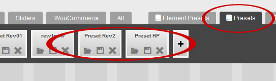
Select any of the available presets or create a new one clicking the [ + ] button
You can manage your preset items by using the tools that are available on each of these preset´s buttons (see the figure below).
Load this preset: Selecting this option you load the preset.
WARNING: All unsaved actions in your layout will be lost and overwritten by the selected preset.
Save to this preset: Saves your changes to the selected preset.
Delete this preset: This option deletes the preset.
Add new preset: Click the [ + ] button to create a new empty preset to that you can save your actual preset.
General Settings
Besides of all the settings related to the REVO Composer, you can enable
or disable the
Page Title Bar and
Breadcrums
on each your page by using the options below the main content of each new
added or existed page. Simply turn on or off these options depending on
your needs.
Posts
General Settings
Posts probably represent the most common content on your web. Here you can
easily set up some special features for all your posts and for the each
one of them separately. After you create a new post (
Posts > Add
New), you can see the mentioned options placed below the main
content field. Obviously, there are the same settings available when you
edit the posts you have already created.
Page Layout
This option allows you to choose one of the preset layouts for your page,
with a sidebar on the left or on the right, or without it. The
Default
Page Layout option uses the Post Layout set in
Theme
Options > Single Post.
- NOTE: Depending on what layout you
choose, the options below will vary or disappears.
Blog Left/Right Sidebars
Select an optional sidebar from the dropdown list of your custom ones you
had created in
Appearance > Theme Options > Sidebar Manager.
Use Featured Image/Gallery/Video in Post
You can choose whether or not to display a featured image or gallery or
video (depending on a selected post format) at the top of your post page. If the switch is off, only the
possible images which you have put into the post content are shown.
Associate Product
Click into the field and select a product to be associated with the post
page.
- NOTE: The dropdown list includes
just the products offered via the Woocommerce solution.
Rating Settings
Rating Title
This is a label text of your ratings box. Fill in the field with your
version.
Show Rating
Tick the box or let it unchecked depending on whether or not you want to
show rating.
Rating Criteria
Here you can set up user´s and your rating criteria. Click "Add" to make
your (administrator´s) rating criteria options available and fill in the
fields. The first value represents your own rating (insert a number from 0
to 1 with the decimal point), the second one is a number of ratings.
Notice, that the users ratings values are filled automatically.
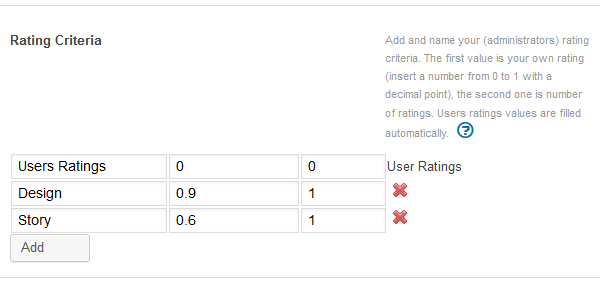
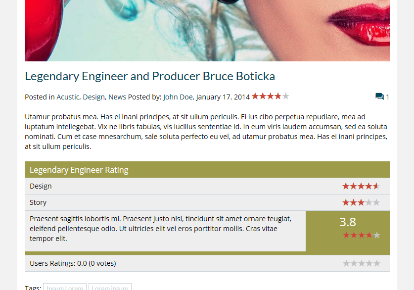
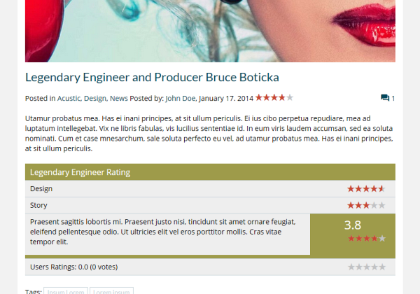
Look at how the
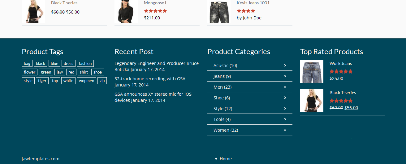
Rating Criteria settings appear in the sample post (fig. below)
Show Rating Description
Tick the box if you want to show your description in the ratings box.
Rating Description
This is the field which you can fill in with the text you want to display
in the ratings box (if the Show Rating Description option above is
ticked).
Overall Rating
Here you can choose whether or not to show an overall rating. If yes, tick
the box.
Enable User Rating
Tick the option if you want allow users to rate a post.
Include User Rating in Total Ratings
Tick the option if user´s rating has to be included in total ratings.
Categories
The GoodStore theme gives you some extra options for your categories of
posts. Navigate to
Posts > Categories and set up a new
category, or choose any added one you need to edit.
Category Layout
Choose one of the preset layouts for your Category.
Category Left/Right Sidebars
Select optional sidebars from the dropdown list of your custom ones you
had created in
Appearance > Theme Options > Sidebar Manager.
Category Posts Layout
Choose one of the preset layouts for posts in the category.
Category Posts Left/Right Sidebars
Select optional sidebars for posts in the category from the dropdown list
of your custom ones you had created in
Appearance > Theme Options > Sidebar Manager.
Portfolio
At first you need to create a category for your portfolio. Navigate to
Portfolio > Categories and add your new category or categories (e.g.
Photography, Videography etc.).
Than go to
Portfolio > Add New. Here you create a portfolio
item which type can be defined selecting an desired option in the
Portfolio
Type dropdown list below the content field.
Portfolio Settings
These are the settings you can find below the content field of each new or
already created portfolio.
Portfolio Type
Define a type of your portfolio selecting the desired one in the dropdown
list. You can choose from the
Image, Gallery, Video, Audio, Link
options. Note that the next related option(s) varies depending on the
portfolio type you have selected.
Tick the
Categories which you want the portfolio item to
associate with. If you need, set the other options and click [Preview] or [Publish] button.
- REMEMBER: Never put an image to the
content field since it won´t be shown. You have to add it and set up as
Featured Image (the option at the bottom right corner).
- TIP for a video thumbnail: If you want to use an
thumbnail of your choice instead of that generated from your video URL,
you can set your own featured image for this video.
Team
The theme allows you to create and manage your teams/categories and their
member´s profile cards. Navigate to the
Team item in main menu
and get started.
To create a new
team category or modify an existing one,
navigate to
Team > Categories and fill in the empty fields
or select the categories to be edited while following the appropriate
descriptions.
To add a new member of team, select the
Team > Add New item
and fill in the member´s name, description and the
Team Settings
(the member´s profile card).
Testimonial
Positive testimonials are a good way to increase sales. This theme allows
you to add and keep testimonials on your page.
To create a new
testimonial category or modify an
existing one, navigate to
Testimonial > Categories and fill
in the empty fields or select the categories to be edited while following
the appropriate descriptions.
To add a new testimonial, select the
Testimonial > Add New
item and fill in the testimonial text field and the person´s data. You can
also insert the person´s photograph.
Shortcodes
WordPress Shortcodes are a simple set of functions for creating macro
codes to be used in post and page content. To creating pages, we recommend
using our new advanced
REVO Composer page builder
which makes your work more comfortable. However, a decision about whether
to use shortcodes or the page builder depends on your preferences.
The GoodStore theme comes with a number of shortcodes allowing you to
easily add styled content to your site. Some of them allow you to
completely redefine the post or page content. Some shortcodes can embed
files or create objects, some others can change the layout of the content.
Conveniently, the available shortcodes have been included under the
dropdown button in the WYSIWYG content editor which you can use when you
add or edit the Posts or Pages.
- NOTE: In case of pair shortcodes
you always need to put the part of your content which you wish to be
affected, between the two bracketed code elements. Use the following
syntax: [shortcode]Your text...[/shortcode].
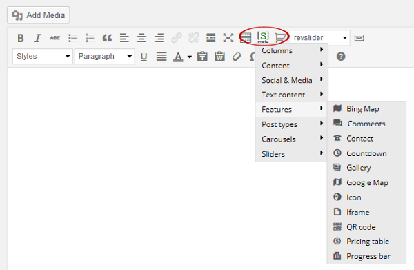
Click the

shortcode button to open up a dropdown list of the available shortcodes
and their settings.
Columns: Choose this item if you want to wrap your
paragraph into some of the offered variants of columns.
Content: You can add several content elements or parts of
content like images, buttons, dividers, lists etc. into your content.
Social & Media: You can embed both Youtube and Vimeo
video content as well as add social icons of your choice.
Text Content: Here you find some text elements and
typography tools such are accordion, block quote, "call to action" button,
info box. etc.
Features: There are several useful features you can add
to your content (gallery, maps, comments, countdown, pricing table, QR
code etc.)
Post Types: You can add FAQ, Portfolio, Team and
Testimonial post type.
Carousels: Choose and put the type of carousel element
you prefer into your content.
Sliders: Add a slider to your content.
Widgets
Apart from the standard widgets included in Wordpress and from the
WooCommerce (or some other 3rd party´s add-ons that you may use), the
GoodStore theme gives you seven custom
J&W widgets.
You find them in
Appearance > Widgets. Widgets can be placed
into the
Header Widget Area, Header Widget Area 2, Footers 1 - 4,
Shortcode-menu, Widget menu areas 1 - 4, as well as into all
your custom sidebar positions you have created in
Theme Options >
Sidebar Manager section. Simply move the chosen widget to the
position you need by drag´n drop method. Then open the widget´s dropdown
options and set up all you need.
J&W
- Custom Banner Widget
This widget allows you to display one of your custom banners (see
subchapter
2.9.7 Banner - Custom 1).
J&W - Latest Posts Widget
Use this widget to fetch latest posts from the selected categories.
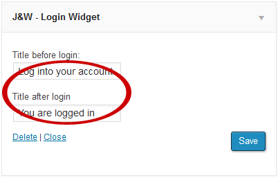
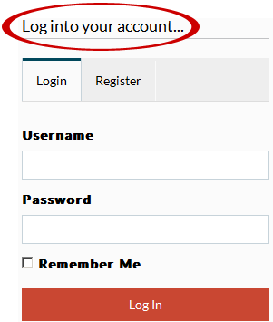
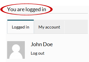
J&W - Login Widget
The theme-based login window. You can insert your titles before and after
login.
J&W - Rating Widget
You can show posts with ratings by using this widget. Just fill in the
widget´s title, enter number of posts to be shown and select the
categories to fetch the posts from.
J&W
- Social Widget
Here you can simply add links to your social profiles at
Google+,
Twitter, Facebook, Instagram, Youtube, Vimeo, as well as a link
to
RSS chanel. You can also decide whether or not to
animate the content.
J&W - Tab Posts Widget
This widget allows you to set up a number and selection of
popular and
recent posts and
comments previews, and a number of tags as well. This
content is sorted to the tabs which labels you can (re)name in this widget
too. The widget looks like the one you can see at the following picture
from our demo site.
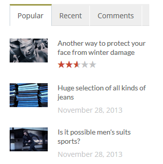
An example of how the
J&W - Tab Posts Widget can look like on page
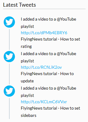
J&W - Twitter Widget
This theme-based widget allows you to set up your latest tweets from the
Twitter. You can place it e.g. in a footer area.
First, you have to fill in the Twitter API´s keys in
Appearance >
Theme Options > Advanced > Twitter API section. To get
them, please visit
https://dev.twitter.com/apps/new.
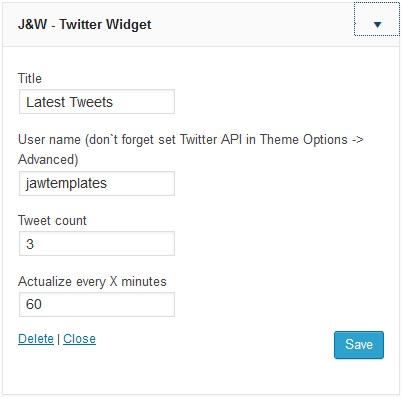

Look at how the sample
J&W - Twitter Widget settings appear on page
Slider
Depending on your preferences, you can use both our
J&W
Slider and the third party´s
Revolution Slider
and combine use of them across your web assigning the first type of slider
to some your pages and the second one to other pages of your choice.
We recommend that you put a chosen slider to your page by using the
REVO
Composer page builder. However, if you prefer work with
shortcodes,
you can choose this way.
- NOTE: Be aware that the J&W
Slider is installed as a separate plugin with the theme, but the
Revolution Slider is added as part of the J&W Shortcodes
plugin supplied with the theme as well.
Setting up the J&W Slider
To set up and manage the J&W Slider, navigate to
Appearance >
Theme Options > Featured Area > J&W Slider and set the
particular options according to the attached descriptions or read the
related
2.3.2 J&W Slider subchapter to learn
more about the options.
Revolution Slider
To learn how to set up and manage this slider, refer to the Revolution
Slider plugin´s documentation or select the [Revolution Slider]
item in the Wordpress admin menu to work with the slider settings.
Typography
Get inspired of some prestyled typography in our
demo.
Video Tutorials
We recommend that you follow us on our
YouTube channel, as there are clearly explained some issues you may need help with.
Icons
Please follow this link
Icons
Sources and Credits
-->